
PhotoLesa's photography gear provided by:


 It ain't rocket science, but by gosh it can feel like it: You've got a brochure to create, maybe an ad for a newspaper or magazine, and no matter what you do, the layout just doesn't gel and quite honestly, it looks like crap.
What do you do? Where do you even start? How, I ask you, do graphic designers create such works of beauty? What are their secrets?
Hear me now, dear grasshoppers, when I say that if you can memorize the following four principles you have what it takes to be a good designer. Truly. If you've never even driven past an art school (much less gone to an actual design class), you can create layouts that are visually pleasing, easy to read, and memorable—as long as you stick to the following four basic principles we're about to cover.
Now, these aren't Lesa's secrets, oh goodbess no. These are Robin's secrets. I'm speaking of Robin Williams, a brilliant author who discovered these four basic design principles and published them in a book named The Non-Designer's Design Book. I bought this book just before I went back to college (at the Art Institute of Dallas) and I'm happy to tell you that it played an integral part in my graduating with a perfect 4.0 GPA.
Skeptical? I don't blame you. Let's go over the four principles, put them into practice, and see what happens.
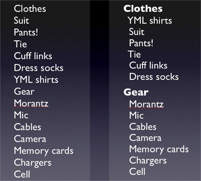
Group related items together. Use spacing to convey visually what information is related. Bits of information that are not related should not be in close proximity to other bits on the page. This helps create visual structure and organization and communicates more clearly. It serves as a visual clue to where you should start reading the piece and where you should stop.
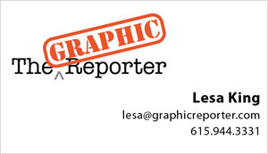
In the example below of what my business card would surely look like if I had a printing company design it, how many times does your eye stop?
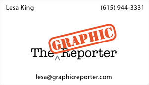
My eye stops about four times. Since there is information in the top two corners, the natural reaction is to check and see if there is something in the other corners as well.
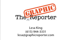
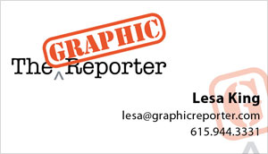
However, the design looks much better when I group related bits together, even if I center everything (which is usually a no-no, except in the most formal of situations). How many times does your eye stop? Twice. No more.
Each item on the page should have a connection with another item on the page. Alignment creates a visual connection for the reader. Proper alignment gives readers a hard edge to follow. The edge forms an invisible line that connects the text, ,making it stronger, cleaner and more dramatic.
“The strength of the edge is what gives strength to the layout.”—Robin Williams, The Non-Designer’s Design Book, Peachpit Press. (Buy yours today!)
Taking the same business card, let's apply a right alignment to the information that's related:
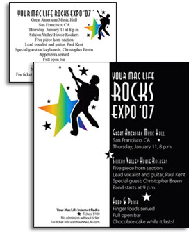
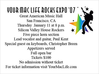
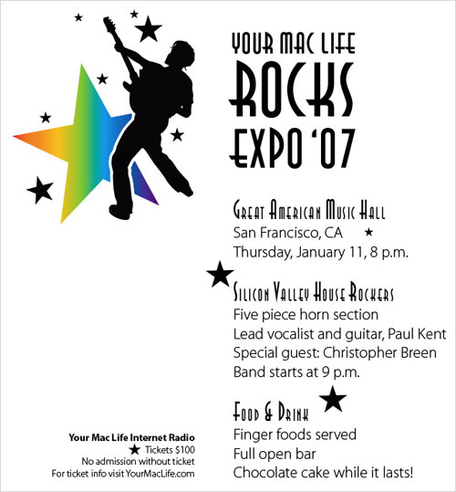
Let's use another example now, that of a party ad. Below, you'll see that everything is smashed together and it's all centered. It's a truly uninspiring ad thus far.
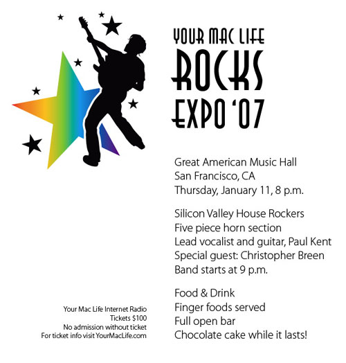
After we apply the rules of proximity and alignment, look what we have:
Repeat a design element throughout the entire piece. Think of it as consistency.
Using the elements already on the page, pick one and turn it into a repetitive symbol, like the big G in my business card:
If two elements are similar, make them very different. This creates visual interest and draws the reader’s eye. Think outside the box and don’t be afraid to make the contrast STRONG!
On my business card, I used the back for contrast and did this:
On the party ad, I added a black block behind the type:
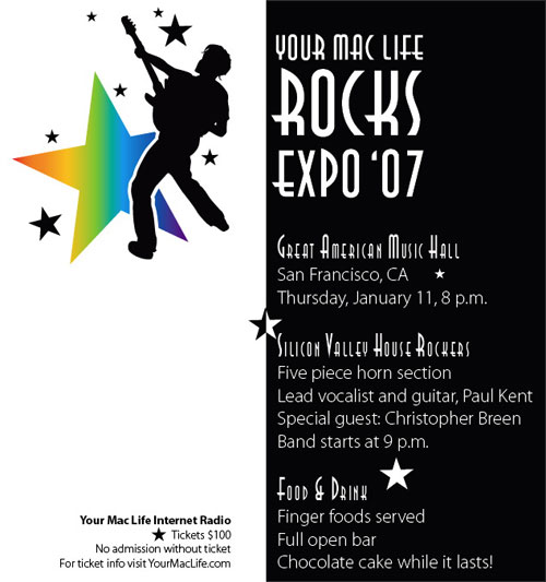
Wow, what a difference that made!
I hope you can see how applying just these four basic rules made a galactic difference in our designs. Give it a try yourself and you’ll be amazed at how easy it is!


PhotoLesa's photography gear provided by: