
PhotoLesa's photography gear provided by:


So many filters, so little time. Oh sure, you may have perused The Almighty Filter Menu from time to time, but do you really understand their power and the plethora of special effects they unlock? Of course you don't. Nobody really does. Aside from texturizing text and creating cool edge effects, you can use filters to create realistic fire (it takes three of them to be exact).
This technique is actually from a feature article I wrote for Elements Techniques magazine last year; a fantastic tutorial-based publication on all things Elements-related. If you're an Elements fan, run--don't walk!--on over to ElementsUser.com to get a subscription. And though this here tutorial uses screen shots from Elements (version 4 on the Mac), the steps are the same in Photoshop CS3. Read on!
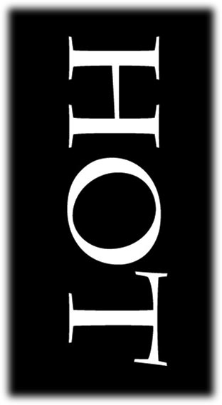
The fun begins by placing some white text atop a black background.
Step 1: Open a new document and choose Edit > Fill. Fill the background layer with black by choosing black from the Use pop-up menu. Press OK. Press T to select the Type Tool and in the Options bar at the top of the screen, choose white from the Color pop-up menu. Type the word HOT in all caps at a fairly large point size.
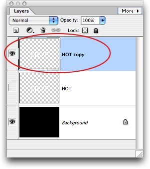
Step 2: Choose Layer > Simplify Layer. This turns the text into pixels which we can then apply filters to. Unfortunately, it also makes the text un-editable so if you want to modify it you'll have to create a new Type layer. Duplicate the type layer by pressing Command + J (PC: Ctrl + J) and turn the visibility icon off on the original type layer. This is what your Layers palette should look like now:
To create the look of flames, you need to add streaks to the text. That's easy to accomplish by using the Wind filter, but... wind doesn't blow up and down--which is the direction you want the flames to go--it blows from the left or from the right. The fix is to rotate the text, apply the filter, and *then* rotate the text back.
Step 3: Press Command + T (PC: Ctrl + T) to summon Free Transform. Position your cursor beneath one of the corner handles and while holding the Shift key, spin the text around 90 degrees clockwise. Press Return to accept the rotation.
Step 4: Choose Filter > Stylize > Wind, and choose Wind for the Method. For Direction, choose Left to Right and then press OK. Run the filter at least one more time by pressing Command + F (PC: Ctrl + F) to create more streaks. If you want really tall flames, run it again.
Step 5: Press Command + T (PC: Ctrl + T) to summon Free Transform and rotate the text counterclockwise 90 degrees so that it's right side up. Press Return to accept the rotation.

Next you need to soften the flames and zap some of the extreme streakiness we created in the step above. Plus, you need to give the flames a background onto which you can run yet a another filter in a few minutes.
Step 6: Choose Filter > Gaussian Blur. On this relatively low resolution image, a radius of 2 pixels was enough to blur the image so that the individual wind streaks aren't so apparent.
Step 7: To create a new layer below the one currently selected, Command-click (PC: Ctrl-click) the New Layer icon at the top of the Layers palette. Fill this layer with black by choosing Layer > Fill and picking black from the Use pop-up menu. Shift-click the streaked layer's thumbnail in the Layers palette so that both layers are selected and choose Merge Layers from the More menu, as shown below.

You've got the beginnings of flames now, but you'll need to use yet a third filter to give them a more realistic shape.
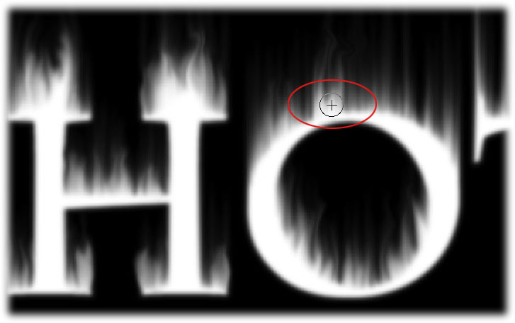
Step 8: Choose Filter >: Distort >: Liquify (in Photoshop, choose Filter >: Liquify). In the petite (ha!) dialog box that opens, use the Warp Tool—set to a fairly small brush—to pull the streaks slightly outward and upward. (he Warp Tool should activate automatically when the dialog box opens, but if it doesn't, it lives at the top left.)
To stretch the streaks into flames, click and drag from the base of the streaks upward and outward, in order to pull some of the white from the letter-forms themselves (this helps with the whole white-hot look near the letters). Depending upon the look you're after, you may or may not want to warp the shape of the letter-forms themselves (I didn't mess with them). Press OK when finished stretching flames.
Note: This is the most time-consuming part of the technique. There's a lot of streaks so you could spend at least 30 minutes stretching them out. It's worth it though!
Tip: Since the Warp Tool uses a brush cursor, you can use the left bracket key to cycle down in brush size ([), and the right bracket key to cycle back up (]).
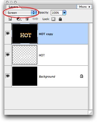
Step 9: To allow the original text layer below to show through, change the blend mode of the flame layer to Screen. Use the Move Tool to realign the type layers if you need to.
Color the flames
You can easily add yellow and orange to the flames with a couple of well-placed Hue/Saturation adjustments, and sprinkle in some red with the quick switch of a blend mode.
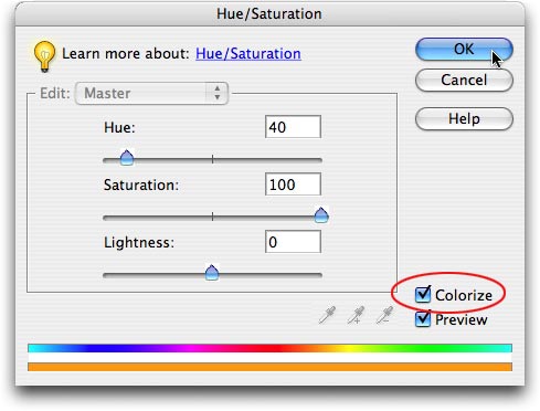
Step 10: To make the flames yellow, choose Enhance > Adjust Color > Adjust Hue/Saturation. Click the Colorize button at the bottom right and adjust the Hue slider to 40 and the Saturation slider to 100. Press OK.
Step 11: To add orange, duplicate the flame layer by pressing Command + J (PC: Ctrl + J) and then choose Enhance > Adjust Color > Adjust Hue/Saturation. Make sure the Colorize button is NOT checked and enter -20 in the Hue field (don't forget to include the minus, else you won't get orange).
Step 12: To add red, change the blend mode of the duplicate flame layer to Overlay. If the red is too overpowering, reduce that layer's Opacity. Here's what our layers palette looks like now: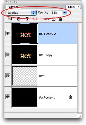
And here's the fiery text:

To finalize the effect, apply a color fade to the original letter-forms by using the Gradient Tool.
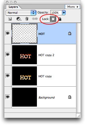
Step 13: Drag the original type layer to the top of the layers stack and click the Lock Transparency icon at the top of the Layers palette. This will confine the Gradient fill to the letter-forms themselves, instead of the whole image.
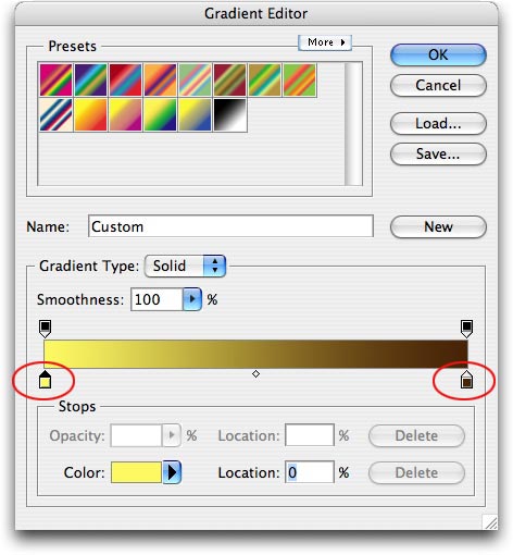
Step 14: Press G to select the Gradient Tool and in the Options bar, choose the Linear Gradient icon and then click the Edit button next to the gradient preview. In the resulting Gradient Editor, click the tiny color block (referred to as a "color stop") at the bottom left. That color will now appear in the Color pop-up menu at the bottom of the dialog. Click the color well once to summon the Color Picker, choose a nice yellow, then press OK. Next, click the color stop at the far right and choose dark brown. The gradient preview should now show a smooth transition from yellow to brown. Click OK when finished.
Step 15: Back in the document, click and hold in the center of the "O" and drag downward to apply the gradient. If you are non-plussed by your first professional gradient-dragging attempt, you can keep clicking and dragging until you get the look you like.
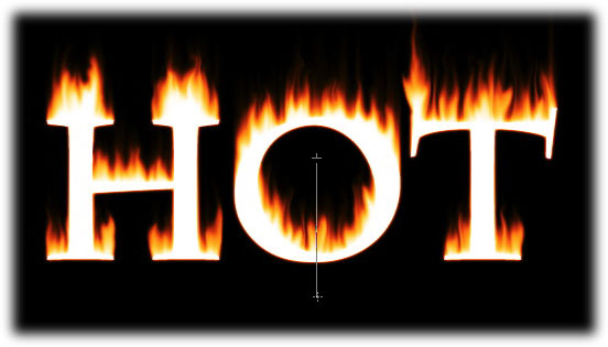
Step 16: Press M to select the Move Tool and nudge the type layer down a pixel or two to give it a slightly 3D look.
Here's the finished product:

Was it a lot of work? Perhaps. Was it worth it? Heck yes! That's some of the best-looking "made from scratch" fire this side of the Pecos. Until next week, happy flames!


PhotoLesa's photography gear provided by: