
PhotoLesa's photography gear provided by:


This week's tutorial is the direct result of the wonderful forums and user galleries over at ElementsVillage. The place is chock full of digital photographers, scrapbookers, and creative types of all kinds who just love sharing their work (I'd be hard-pressed to find a friendlier group of complete strangers). The owners of the site also put out a wonderfully informative newsletter called Elements Techniques. If you haven't subscribed yet, just do it.
Skill levels at the Village range from that of extreme newbie to seasoned pro, so the questions and answers are all over the place in both detail and length. It's quite common for folks to see artwork in various user galleries and wonder how it was created. They'll start a forum thread about the technique or sometimes they'll even email me (I'm a "casual forum lurker"). I can't always zap up a tutorial right away, but I get around to it eventually. Al Bliven, this one's for you!
To create a photo spotlight, we'll use a solid white layer with a circular cut-out to simulate a photo frame. By reducing the white layer's opacity, the photo is lightened (also called "screened back") in those areas. It's a simple enough effect, though uses some very basic, core techniques which every Elements user should have in their bag of tricks. Let's get started!
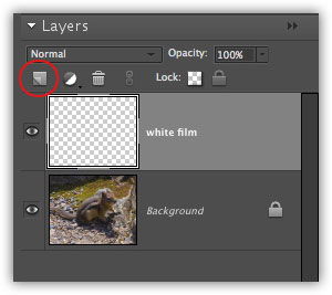
Step 1: Create a new, blank layer by clicking the new layer icon at the top of the Layers palette (circled in red below).
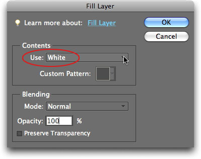
Step 2: Choose Edit > Fill Selection, and pick White from the Use pop-up menu. Make sure Opacity is set to 100% then press OK (you can double-click the layer name and name it something else if you'd like). Your photo should be completely white at this point.
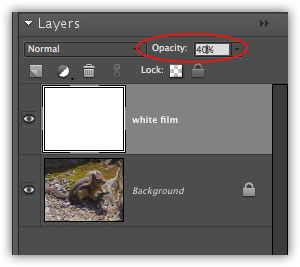
Step 3: Over in the Layers palette, lower the opacity of the white layer to about 40%. Now you should be able to see your photo again.
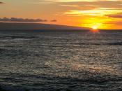
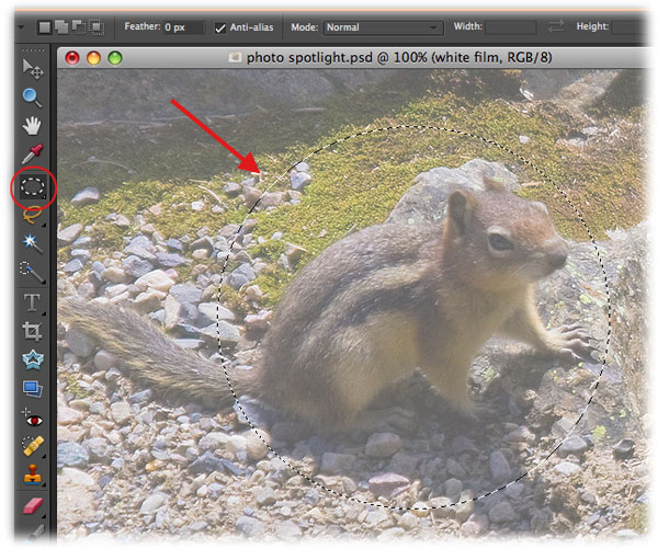
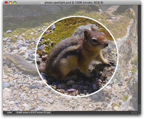
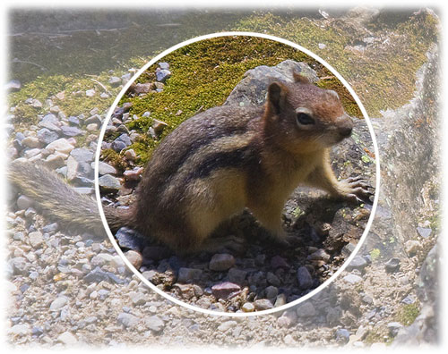
Step 4: Grab the Elliptical Marquee tool from the main Tools palette and draw a circle around your subject matter (like this cute little chipmunk I snapped the other day while hiking in the Canadian Rockies with my good friend Maurice). TIP: If you want to draw a perfect circle, hold the Shift key as you drag. If you want to draw from the inside out, hold the Option key (PC: Alt). If you want to move the selection around as you're drawing it, press and hold the Spacebar.
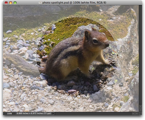
Step 5: Press the Delete key to cut the circle out of the white layer. Here's what we have now:
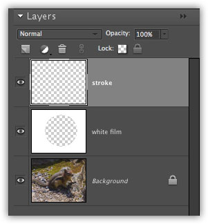
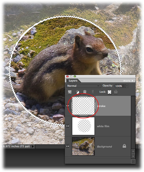
Step 6: While you still have marching ants around the circle, create another new layer by pressing the new layer icon at the top of the Layers palette and name it stroke, as shown below.
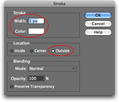
Step 7: Choose Edit > Stroke (Outline) Selection and enter 5 px for Width, then click the little color well (the little block beside the word "Color") and choose white from the resulting Color Picker. Choose Outside for Location then press OK. Press Command + D (PC: Ctrl + D) to deselect the marching ants.
Here's the finished "spotlighted" photo:
If you want to change the color of the stroke, you can use a Hue/Saturation adjustment layer instead of recreating it.
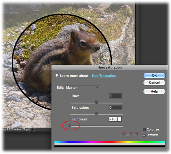
Changing the color to black
Step 8: Command click (PC: Ctrl click) the stroke layer thumbnail (circled in red below). This will load a selection of the stroke.
Step 9: Click the half white/half black circle at the top of the Layers palette and choose Hue/Saturation. In the resulting dialog, grab the Lightness slider and drag it all the way to the left.
Changing the stroke to any other color
If a white or black stroke isn't doing it for you, try changing it to a different color.
Step 10: Click the Colorize checkbox at the bottom right of the Hue/Saturation dialog. This will let us add color.
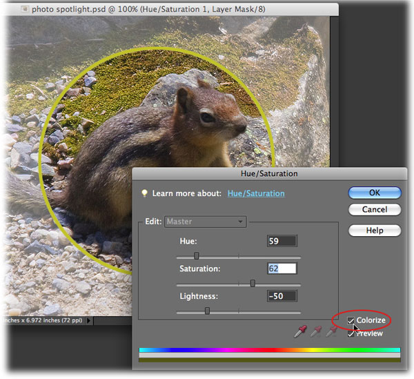
Since technically we have no color in the stroke at this point--we started with white and changed it to black--we need to introduce some color before we can play with it. Therefore, you must adjust the sliders in the OPPOSITE order in which they appear. That is, after clicking Colorize, move the Lightness slider, then the Saturation slider. At this point, you have introduced a color shift and you can now move the Hue slider and see results (otherwise it'll appear as if nothing is happening). Just remember to reverse the "tweaking order" if you will :)
For this particular photo, I like the white stroke the best. Artwork is very subjective, so choose a color that pleases you the best.
That's all for now! Thanks again to Al over in the ElementsVillage for the idea. Until next week, happy photo spotlighting!


PhotoLesa's photography gear provided by: