
PhotoLesa's photography gear provided by:


Welcome to the third installment of our journey through the blending modes founds in both Photoshop and Elements. We're still exploring the second category of modes that begin with Darken; and, as you already know, these modes have the power to darken the underlying image.
This week it's Color Burn's turn to be in the spotlight and wouldn't you know it's one of the hardest blending modes to explain. In fact, it's so hard to explain that I'm going to skip the explanation altogether. If it sounds like a cop-out, well, you're right. The only thing I can say is that sometimes you just have to trust what you know and not worry about the why or the how. I mean, it's completely within the realm of possibility that you (and I) will come to understand how this mode does what it does after using it over a period of time. It's highly unlikely, but possible nevertheless :)
That being said, here's what you need to know about this mode:
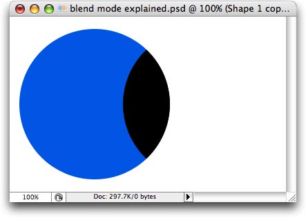
In the tradition of tutorials past, here's what the Color Burn mode looks like using the blue and orange circles we started this series with:
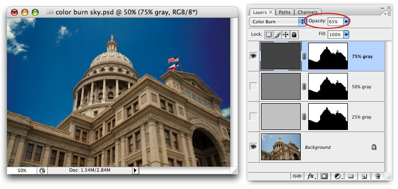
Probably the most useful trick of all for the Color Burn blending mode is to fix a dull and boring sky. Just create a new layer on top of the original photo and fill it with gray. The darker the gray, the darker the sky will become. Please allow me to illustrate on a photo of the Texas state capitol which I shot a few months back.
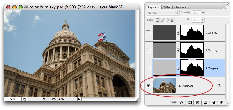
I've already created three layers perched atop the original image and filled them with varying percentages of gray. I've also added layer mask to hide the capitol so that the change affects the sky only (if you're curious, I used the Magic Wand and clicked on the blue, then choose Select > Similar about five times until the whole sky was selected). I'm including the Layers palette in the next several screen shots so you have a clear (hopefully!) understanding of what's happening. Here's what the original image looks like:
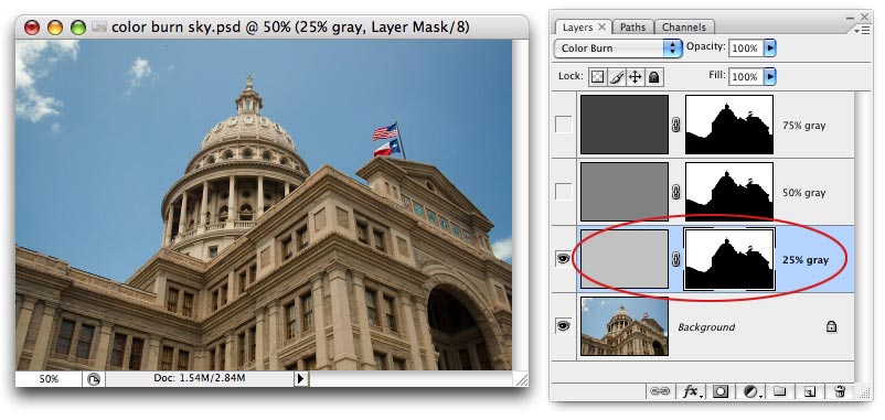
Using a layer filled with 25% gray set to Color Burn mode, the sky begins to darken ever so slightly:
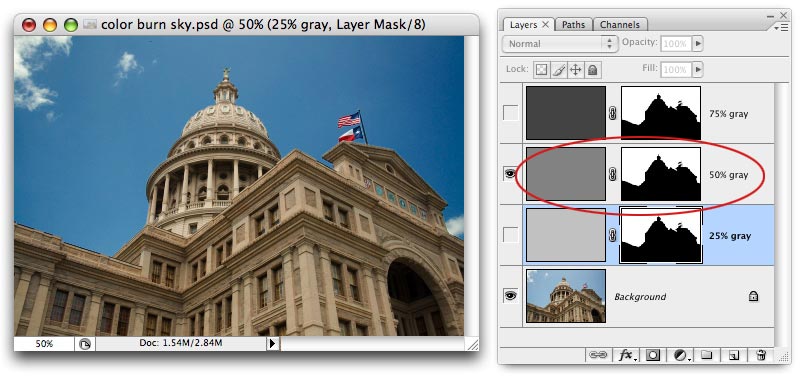
Here's what the sky looks like using a layer filled with 50% gray, also set to Color Burn mode. As you can see, the sky is darkening as I use darker shades of gray. NOTE: A slight vignetting is also being introduced as the image darkens, and it's most noticeable on the upper right side. That's from my camera lens and could be fixed with the Lens Distortion filter, just FYI.
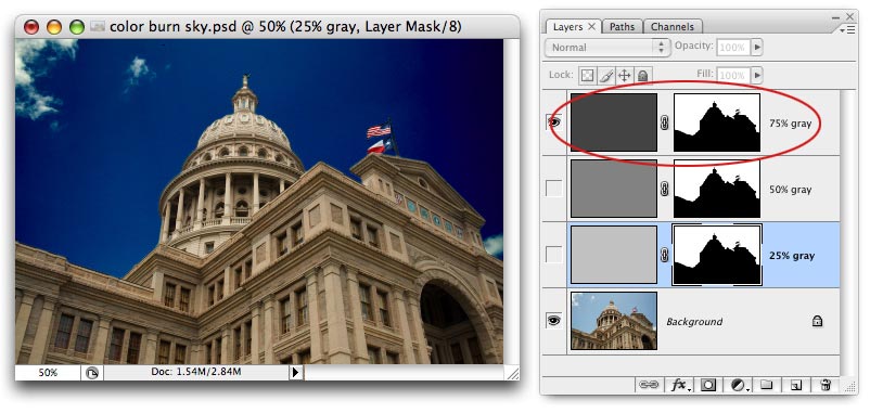
Using a layer filled with 75% gray makes the sky super dark:
However, if I lower the Opacity of the 75% gray layer to 65%, the sky looks just right (if it weren't from the vignetting it'd be perfect!).
Another fabulous use for the Color Burn mode is to colorize a grayscale. Just create a new layer above the original photo and use the Brush Tool to paint on the new color. Change it's blending mode and this is what you get:
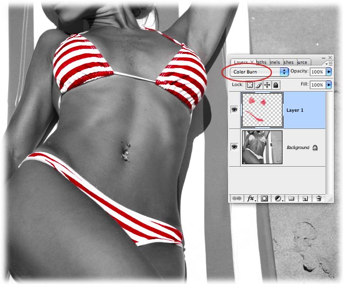
It's true that you can use other blending modes to colorize a grayscale, but Color Burn will produce the deepest, most vibrant and intense color. Overlay, Hue, and Color tend to produce lighter, more saturated colors. In the end, it all depends on what kind of look you're after.
And by teaching you only what you need to know about this mode (or rather, the useful things you can do with it), we were able to skip over the mindless mumbo-jumbo about how it looks to see the primaries used in the colors on that layer and looks at the primaries used in the original layer and depending upon which ones are present it will strip out the third.
Right.
See what I mean? If it doesn't make sense to me, there's no way in heck I can make it make sense it for you :)
Check back next week for more on blending modes and until then, may the creative force be with you!


PhotoLesa's photography gear provided by: