
PhotoLesa's photography gear provided by:


With so much time spent focusing on photo manipulation, I thought I'd spend a little time on text, and explore a very important option living deep inside the Character palette: kerning. Those of you skilled in the art of page-layout using Quark and InDesign know all about kerning, but did you know you can do it in Photoshop? Before I show you how, let's define this odd little word.
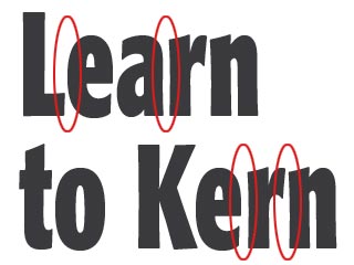
Simply put, kerning is tightening the space between letters. For example, note the distances between the letters circled in this screenshot.
These distances are determined by the design of the font, and as you can see, they are not created equal. To make these spaces more aesthetically pleasing and consistent, the Gods granted us the kerning tool.
Not only will your text look more attractive, it will look professionally done. Nothing spotlights a textual novice quite like the lack of kerning, and you can bet those page-layout gurus we spoke of earlier are cackling behind your back. Hard.
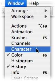
Step 1: Pop open a new document and set some type. Hop up to the Window menu and choose Character (if the palette is already open somewhere on your screen, it'll have a little check mark next to it).
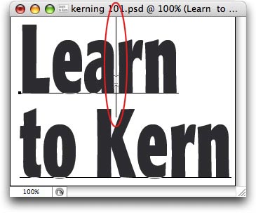
Step 2: Because the distance between each individual letter differs, you'll want to kern each of those spaces individually, that is, you don't want the text selected (highlighted). Press T to select the Type tool, and position the cursor in the first problem area you spot. In our case, that's between the 'a' and 'r' of "Learn."
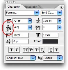
Step 3: In the Character palette, the kerning control lives at far left of the 2nd row of options. Hover over the area circled in red below, and the cursor will morph into a scrubber bar. Drag gently to the left and watch the space between two letters decrease. If you wanted to increase space between two letters, drag gently to the right.
For even more control, use a keyboard shortcut instead: place your cursor between the offending letter pair and press Option + Left/Right Arrow (PC: Alt + Left/Right arrow) to decrease/increasing kerning.
Here's our before and after:
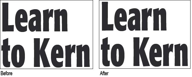
By adjusting just a few spaces, you can make your text look much better and silence those cackling page-layout gurus in one fail swoop :)


PhotoLesa's photography gear provided by: