
PhotoLesa's photography gear provided by:


Continuing with our exploration of making text look better (see node#272), today let's have a look at leading. Like kerning, leading is another trick page-layout gurus have had up their collective sleeves for eons, though for a lot of folks, the terminology is completely foreign. If you have ever put extra returns between lines of text to create space, or wondered how designers make lines of type appear all squashed together, then this tutorial is for you.
Before I show you how to adjust leading in Photoshop, let's define it.
Leading, in typography, refers to the amount of white space between lines of type. The term originates back when type was physically set by hand onto the printing press, when printers used strips of lead in various thicknesses to create extra space.
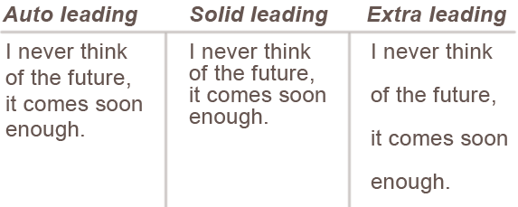
Leading is specified in points, just like type, and it includes the point size of the type itself. For example, 10 point type with 10 point leading would create lines that almost touch each other, and is referred to as "solid leading." By default, leading in Photoshop is set to Auto, which is approx. 120% of the type point size, meaning for 10 point type the leading would be 12 point.
Here's some example text to visually illustrate what we're talking about:
In the glorious world of typography, text itself can become a beautiful graphic. Therefore, learning to control leading can be a useful design tool because it gives you complete control over spacing to an infinite level, right down to the point. Let's face it, adding blank returns rarely create the right amount of space between lines (it's usually a hair too much or too little), and creating each line of text on it's own layer for spacing purposes only just bloats up the size of your Photoshop document unnecessarily. Don't get me wrong, some designs may require that certain words or lines of text live on their own layer so that you can move them around independently, but oftentimes spacing problems can be solved by tweaking the leading instead.
Besides, some fonts just look better and are easier to read with a bit of extra breathing room between lines, so you need to know where that control lives. 'Nuff said :)
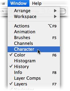
Step 1: To tweak the leading in Photoshop, you need to bring up the magical Character palette. Choose Window > Character. TIP: If it's already open on your screen, the word Character will have a little check mark to its left.
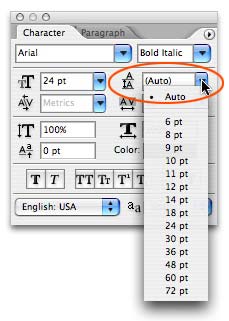
Step 2: The leading control lives directly beneath the font style pop-up menu. With a type layer selected in the layers palette (there's no need to highlight any text), you can choose from different point sizes in the pop-up menu (circled below in red), or type your own directly into the text field.
I encourage you to play around with leading anytime you create type. Remember, though, any change made in the Character palette will remain until it's changed again. So, if you're playing around with leading one day, then type something the next and wonder why the spacing looks funky, just change it back to Auto.
Until next week, may the typography gods be with you! Oh, and in case you're wondering, the quote used in my sample text came from Einstein.


PhotoLesa's photography gear provided by: