
PhotoLesa's photography gear provided by:


I really tried hard to name today's tip, honestly I did. I know I've seen the effect, but I've never heard it referred to in a specific way. I thought of calling it High Contrast Greenish Tinge, or Gen X Extreme Photo Effect, or a number of other catchy titles that didn't quite gel. (Copy editors, being all the wiser, know better than to try and write something catchy and cute, because it will just sounds corny to everyone but themselves.)
However, I did just spend a week in Boston teaching at Photoshop World, where there's a super delicious and cheap seafood place called The No-Name Restaurant. Originally, the place had only eleven seats and a tiny kitchen that served up whatever came in off the boats. It's ugly, but the food is as fresh as it gets. The restaurant's reputation spread, and folks outside the fishing community wanted to investigate. There was only one problem: the restaurant had no name. As you can probably guess, everyone started calling it the no-name, and that's how it's referred to today and thus how this tutorial shall be referened as well. (A winded explanation, yes, but at least you know how my mind works.)
All that being said, today's technique will morph an everyday photo into something rather special; something of very high contrast, sharp, and with a slight greenish tinge to it, and we'll use channels to make it all happen.
All images are comprised of three colors, that of red, green, and blue. Of these three "channels", if you will, one of them will undoubtedly be the lightest, one will be the darkest, and one will be in between. Channels are extremely useful creatures, as you will soon see, as with them you can produce all manner of el coolio photo effects just by tweaking the information contained in each one. Read on!
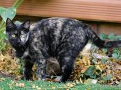
I want to make Miss Bootsie (my girlfriend Kathryn's cat) stand out of this photo, so I'll begin by finding the channel where she appears to really pop. Once I find it, I'll copy that channel's information and paste it into my layers palette where I can start manipulating it.
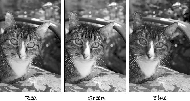
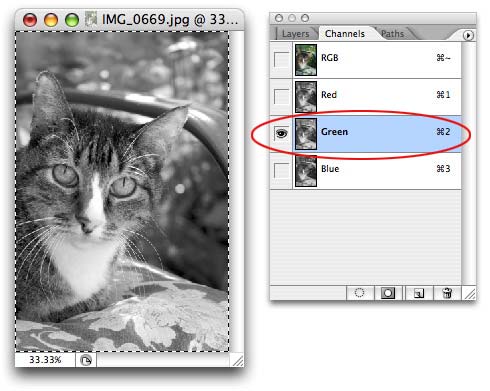
Step 1: Cycle through the various channels of any image by pressing Command + 1, 2, or 3. (TIP: You an also click the Channels tab at the top of the layers palette to see the channels as you go through them.) This will cycle through the red, green, and blue channels as long as you keep pushing the buttons. Once you land on the one where the subject matter (the focus of your image, not the background) really stands out, stop.
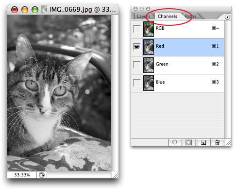
In this example, the background in the green channel is slightly lighter than the rest, highlight Bootsie.
Step 2: Once you've landed on the perfect channel, press Command + A (PC: Ctrl + A) to select all and Command + C (PC: Ctrl + C) to copy it to the clipboard.
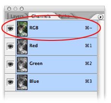
Go ahead and click the RGB channel at the very top of the channels palette so have the color image back.
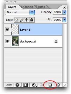
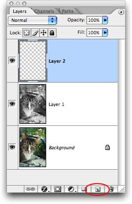
Step 3: Click the Layers tab, and immediately create a new layer by pressing the New Layer icon at the bottom right of the layers palette.
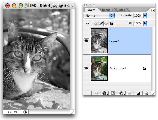
Step 4: Paste the green channel information onto the new layer by pressing Command + V (PC: Ctrl + V).
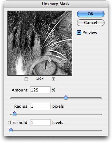
Step 5: Hop up to the Filter menu and choose Sharpen > Unsharp Mask. Enter 125% into the Amount field, 1 for Radius, and 1 for Threshold (these are good numbers for fur).
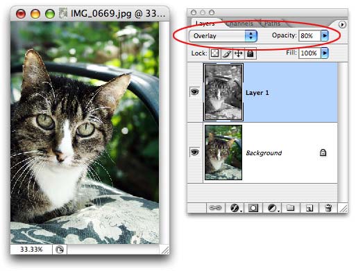
Step 6: Change the blend mode of the layer to Overlay, and reduce the Opacity to 80%, as shown below. Changing the blend mode will allow the color data of the original image to show back through.
Step 7: Create another new layer at the top of the layers palette.
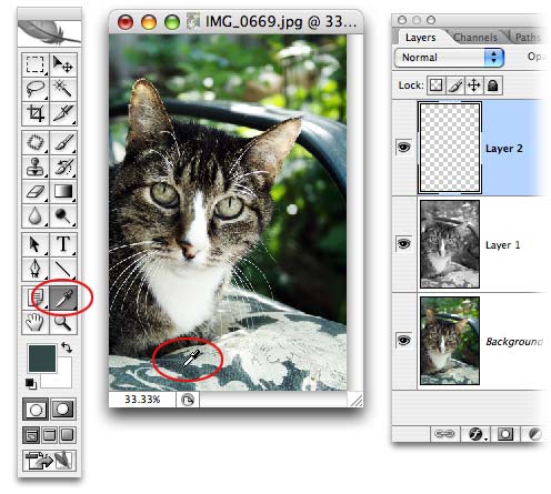
Step 8: Grab the eyedropper tool and sample an area of green from the photo (or if you know what color green you want, just click the foreground color chip and choose it from the color picker).
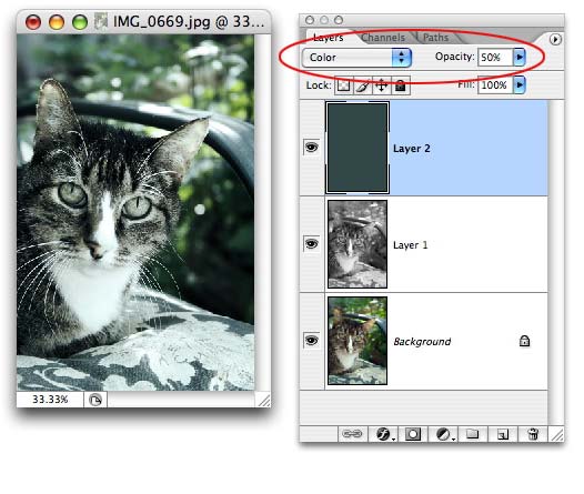
Step 9: Fill the new layer with color by pressing Option + Delete (PC: Alt + Delete). Change the blend mode to Color and lower the Opacity to about 50%. Changing the blend mode once again allows us to see the color from the original image below.
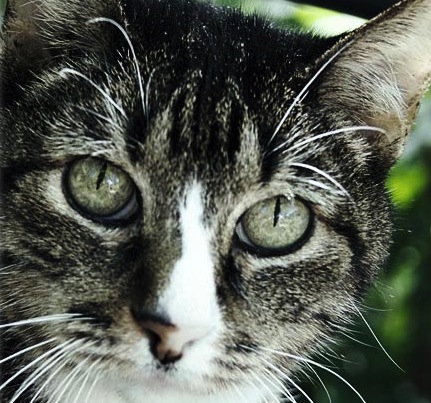
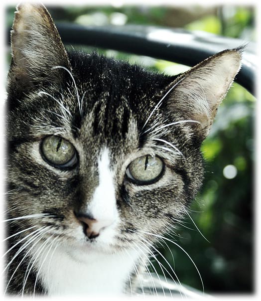
Here's an extreme close-up of the after image so you can see the enhanced contrast and sharpness.
And here's a before and after:
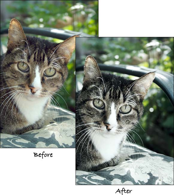
A massive difference, and in my opinion, we now have ourselves a Photo Framing Opportunity. Until next week, may the creative force be with you!


PhotoLesa's photography gear provided by: